Quick test of Canon’s new EOS View Utility
I originally posted this in the forums over at FredMiranda, but thought it might be generally useful:
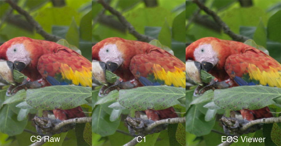
Not a comprehensive test, but I compared the same 10D RAW file converted thru Adobe CS Raw, C1 and the new EOS Viewer Utility. My impression of the final picture quality (particularly color rendering), from best to worst:
#1 – C1 – Very balanced color rendering for the default 10D profile
#2 – EOS Viewer Utility – A bit more saturated on the red channel, but still generally balanced, surprisingly close to C1
#3 – Adobe CS Raw – Somewhat strange handling of the green channel…

Note: This image will not look right in a browser that ignores color-spaces (which is most of them). It has also been constrained using a width tag. I converted the images to 240pixel/inch 16bit tiffs, and am shooting Adobe RGB color space. I left all the conversion settings to the default except for noise removal and sharpening (which I set to none for all converters). I’ve included a small comparison image, but it’s impossible for me to know what you’ll see on your monitor, so you may not see what I’m seeing in the files. I know I should have shot a color chart, but a) they’re expensive and b) I don’t have one. In any case:
Perceived sharpness (local contrast?) was very similar between C1 and EOS Viewer, and a bit lower for CS. All three sharpen up very well (either using USM, or the sharpness settings in the converter).
EOS Viewer advantages:
– Price = free
– Quality
– Improved (and finally usable) speed
EOS Viewer disadvantages:
– Lacks the workflow support of C1
– Lacks the PS integration of CS Raw
Personally I’m planning to get C1 (the workflow piece is really slick), but that purchase will come sometime after a 1D Mark II (priorities ya’ know). For the present I’m planning to use EOS Viewer for most of RAW conversions. I’m as surprised by this as anyone, as the original File Viewer Utility was pretty bad!